The Automobile Arrives in America
It was a bit like the old saying about being “all dressed up, and no place to go.” The early days of the automobile found intrepid “tourers” out for a drive, only to wind up losing their way because directional signs were either nonexistent or they were broken, unreadable, or knocked down. In fact, as early as 1899, horseless carriage owners in New York City met at the Waldorf-Astoria Hotel for the purpose of forming an automobile club – the predecessor of the American Automobile Association – and part of their function was to place and maintain signs on principal local highways to guide drivers through the area or to specific sites.
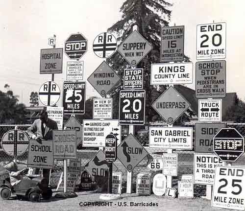
Records indicate that in 1905, the Buffalo Automobile Club installed an extensive signpost network in the New York State. In 1909, the Automobile Club of California undertook the task of signing the principal highways within a 250-mile radius of San Francisco. These could be actual signs, or perhaps they were colored bands around a utility pole. Similar clubs conducted comparable efforts in local areas around the Nation. Unfortunately, competition for signing certain popular routes was fierce and organizations became increasingly aggressive as to which club would sign which routes. One study noted that for 40 to 50 percent of the more traveled roads, it was common to encounter as many as 11 different signs for one single trail or route.
The First Signs Used in the United States
In the early 1920s, representatives from Wisconsin, Minnesota, and Indiana toured several States with the intent of developing a basis for uniform signs and road markings. The group reported its findings to the Mississippi Valley Association of Highway Departments (MVASHD) in 1932. Their efforts resulted in standards for sign shapes, some of which are still in use today.
These pioneers devised a plan to classify sign shapes according to the level of danger represented by highway situations. For example, round signs warned of approaching railroad crossings, which even then represented the most potential danger to the driver. The octagon advised of the next level of danger – the need to STOP for intersections. Diamond signs indicated more ordinary conditions that required drivers to be cautious. Rectangular signs provided direction or other regulatory information. All signs were black letters on white background and were limited to 2 feet (0.6 m) square – that was the maximum width of sign-making equipment. Because round and octagon shapes required the most cutting and wastage, they were chosen for the fewest installations. These shapes made sense because there was little illumination of signs and the rationale was that drivers would respond to the shape of the sign even when they couldn’t see the letters.
In 1924, the First National Conference on Street and Highway Safety (NCSHS) improved on earlier efforts and proposed standardizing colors for traffic control devices. Again, many remain in use today. For example, signs with white letters on a red background indicated STOP. White letters on a green background signified proceed. Black letters on a yellow background advised caution. Black and white signs providing information on direction and distance were specified for every intersection and junction. One combination that didn’t last was white letters on purple background, indicating an intersection!
The First Traffic Sign Manual from AASHO
In 1924, the American Association of State Highway Officials (AASHO, the forerunner of AASHTO) took earlier efforts one step further by issuing a report that combined the previous efforts to standardize sign shapes and colors. The report recognized the superior visibility of the yellow background and advised its adoption for all danger and caution signs, including the STOP sign. The use of red was rejected because of its inadequate visibility at night. This report was also the first to propose the shield to designate U.S. highways.
The importance of the AASHO report is that it became the basis for the first guidebook, Manual and Specifications for the Manufacture, Display, and Erection of U.S. Standard Road Markers and Signs, in 1927. However, this manual addressed only use and design for signs on rural roads. Following a national survey of existing traffic control devices, the Manual on Street Traffic Signs, Signals, and Markings was published to address urban traffic control devices. This manual corresponded with the AASHO rural manual, except that material also addressed traffic signals, pavement markings, and safety zones. The manual also allowed smaller signs in urban areas, and the STOP sign was modified to allow red letters on a yellow background.
Volume 1 of the MUTCD Handbook
It was immediately apparent that having two different manuals simply confused the attempt to standardize traffic control devices. Thus in 1932, AASHO and NCSHS formed the first Joint Committee on Uniform Traffic Control Devices (JC). In 1935, the first MUTCD was published. More accurately, it was mimeographed. The demand for the manual was so great, that a printed version was published in 1937. The 1937 printed version was only166 pages; content was separated into four parts that addressed signs, markings, signals, and islands.
The 1935 edition set the standard for types of signs by classifying them as regulatory, warning, or guide signs. Regulatory signs were black on white rectangles (except the STOP sign was black on yellow or yellow on a red octagon); diamond-shaped slow-type signs warned drivers to slow down; signs that cautioned were square. The manual also promoted using symbols on signs because nighttime roadway illumination was becoming more common.
The 1935 MUTCD also defined some pavement markings. For example, center lines were required only on approaches to hill crests with a clear view of less than 500 feet, short-radius curves, curves with restricted view, or pavements wider than 40 feet. Acceptable colors for center lines were white, yellow, or black, depending on which provided the greatest contrast. It also supplied much-needed clarification on the number, color, and meaning of signal indications. The 3-color signal was adopted as the standard for signal lenses.
In November 1935, the first edition of MUTCD was approved as an American Standard.
MUTCD Editions Reflect the Expansion of Roads and Highways in America
The 1935 MUTCD established the need for a manual that standardized the use and design of traffic control devices (TCDs). As the Nation grew and changed, the MUTCD has grown and changed. The manual has been revised approximately every decade to reflect that growth and change.
As the end of the war neared, traffic engineers realized that the MUTCD had to be completely rewritten. Work on a peacetime edition began in 1944, and a new volume was published in 1948. The major format change in the postwar edition was reorganizing material so that every control device was addressed in only one place. There was also a concerted effort to simplify word signs, and a rounded-letter alphabet was adopted as standard for all signs.
The 1954 15-page supplement to the 1948 MUTCD included 47 revisions and a brief description of each. The most significant change is that the color for the STOP sign was white letters on red background, which resulted primarily from the development of new fade-resistant finishes. The 1954 manual also represents the shift from using mainly regulatory and warning signs to including guide signs. This manual also adopted the use of white letters on green background for Interstate highways.
The New MUTCD Editions for Today’s Roads
Changes incorporated into the 1961 MUTCD truly reflected a changing America. The text was 333 pages long and the manual had two new sections, one to address construction and maintenance operations, which complemented a major section addressing needs of the new Interstate Highway System. There was also a section included for civil defense signing.
A completely rewritten MUTCD premiered in 1971. Some of the most significant changes included adding definitions of “should,” “shall,” and “may” requirements. Orange was designated for construction signing, yellow markings separated opposing traffic, and there was a wider use of symbol signs. School signs were also adopted.
The 1978 MUTCD contained two new parts that addressed highway-rail grade crossings and traffic control for bicycle facilities. There were also revisions addressing the fundamental safety principals concerning work zones, the need for traffic control plans, and an upgraded section on barricades and channelizing devices. New illustrations reinforced the signing and pavement marking standards.
The official current edition of the MUTCD Handbook on PDF